Q2

Food For Tought Logo

2026

Knoll: Total Architecture

Nolan Davis Kiely

Since the inception of the brand in 1938, Knoll has never been in the business of merely making furniture. To the disciplined eye, Knoll is an ongoing experiment in Total Architecture, the belief that a chair, a wall, and a letterform are all governed by the same structural laws. It is a unified expression of space where the object is inseparable from the environment it inhabits.

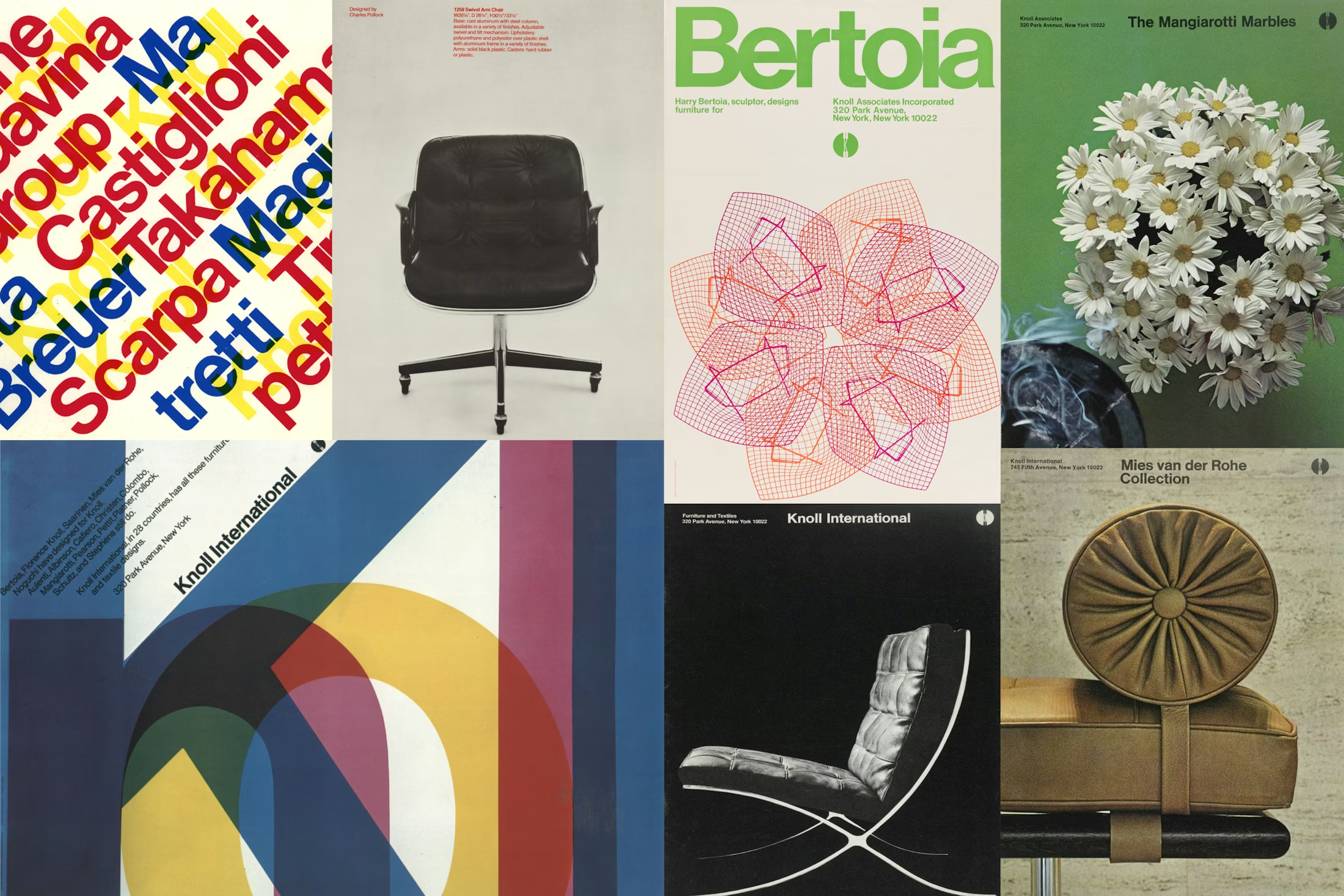
When we look at the evolution of this identity, we are looking at a history of deep, objective sorting. It is a study of how decades of innovation and the rigorous ghosts of the Bauhaus and the poetic precision of Cranbrook were distilled into a visual language. In the early days, figures like Herbert Matter and Florence Knoll understood that design was a matter of syntax. They didn't just place objects; they engineered a perspective.

Above: De De Ce

Below: Order Design
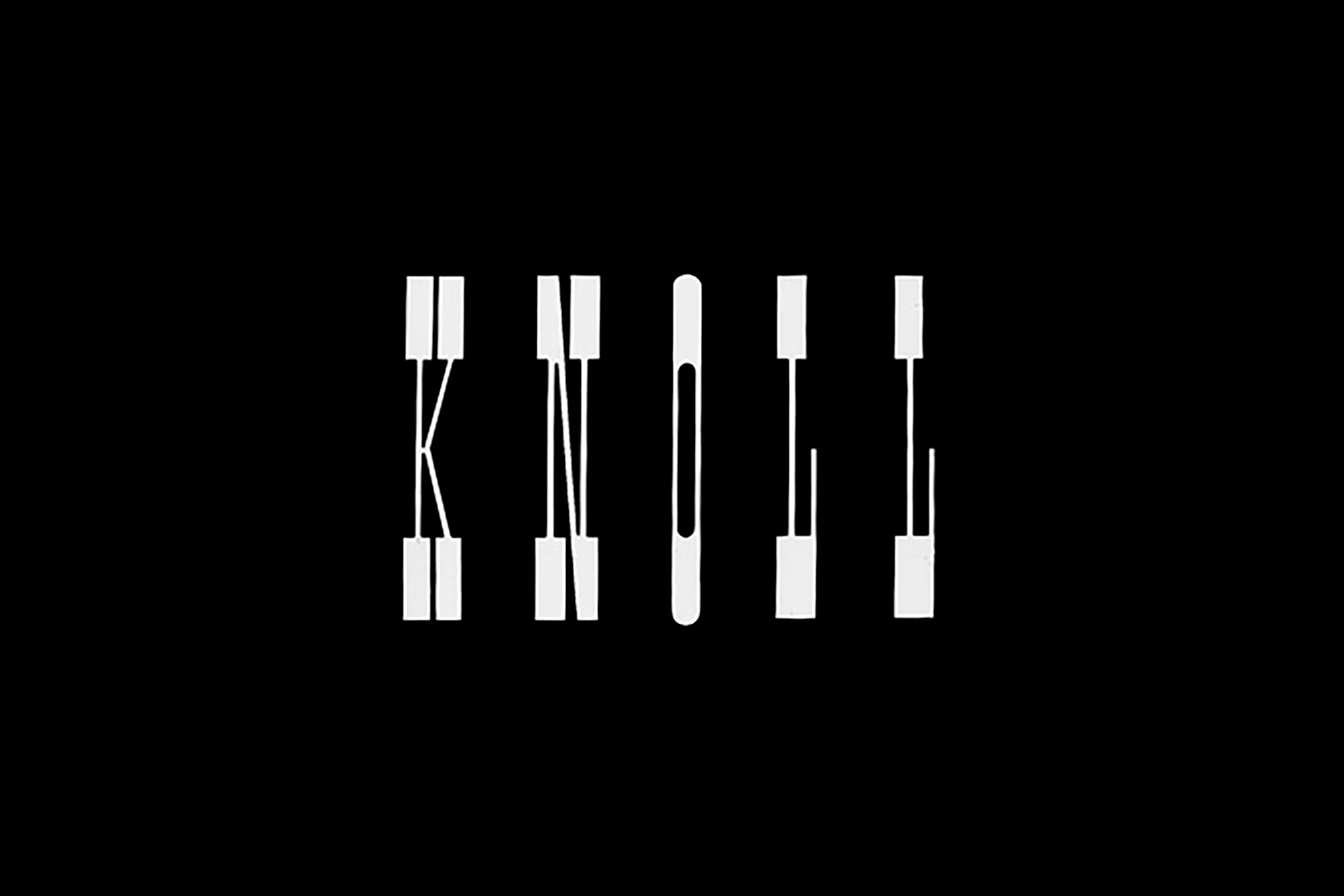
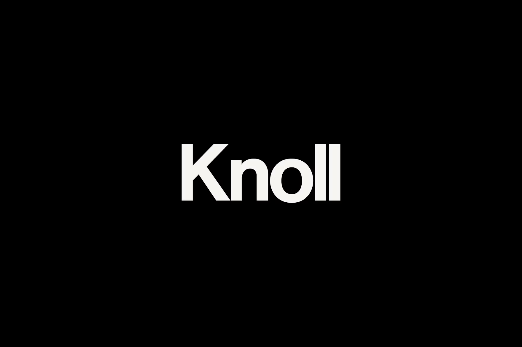
The transition of the identity through the years is a masterclass in the preservation of authority. We see this most clearly in the recent work by Order. Order didn't look for something new; they looked for something true. By leaning back into the iconic "Circle K" and the aggressive, clarity of Knoll Red, they reaffirmed that some truths do not require updating.

The choice of typography (moving into Neue Haas Grotesk) is a logical step. It is a digitized revival of the Helvetica forms that defined the Vignelli era, optimized for a world that requires clarity in many different mediums. To use such a typeface is to acknowledge that the grid is a tool. It allows the brand to scale from the micro-detail of a price list to the macro-presence of a showroom without losing its intellectual center.

This is the emotional core of the Knoll evolution: the understanding that design is never finished. It is a continuous effort to ensure that the brand, the product, and the space work together with a seamless, almost invisible friction. We are reminded that a logo is not a badge of identity, but a component of a larger machine.

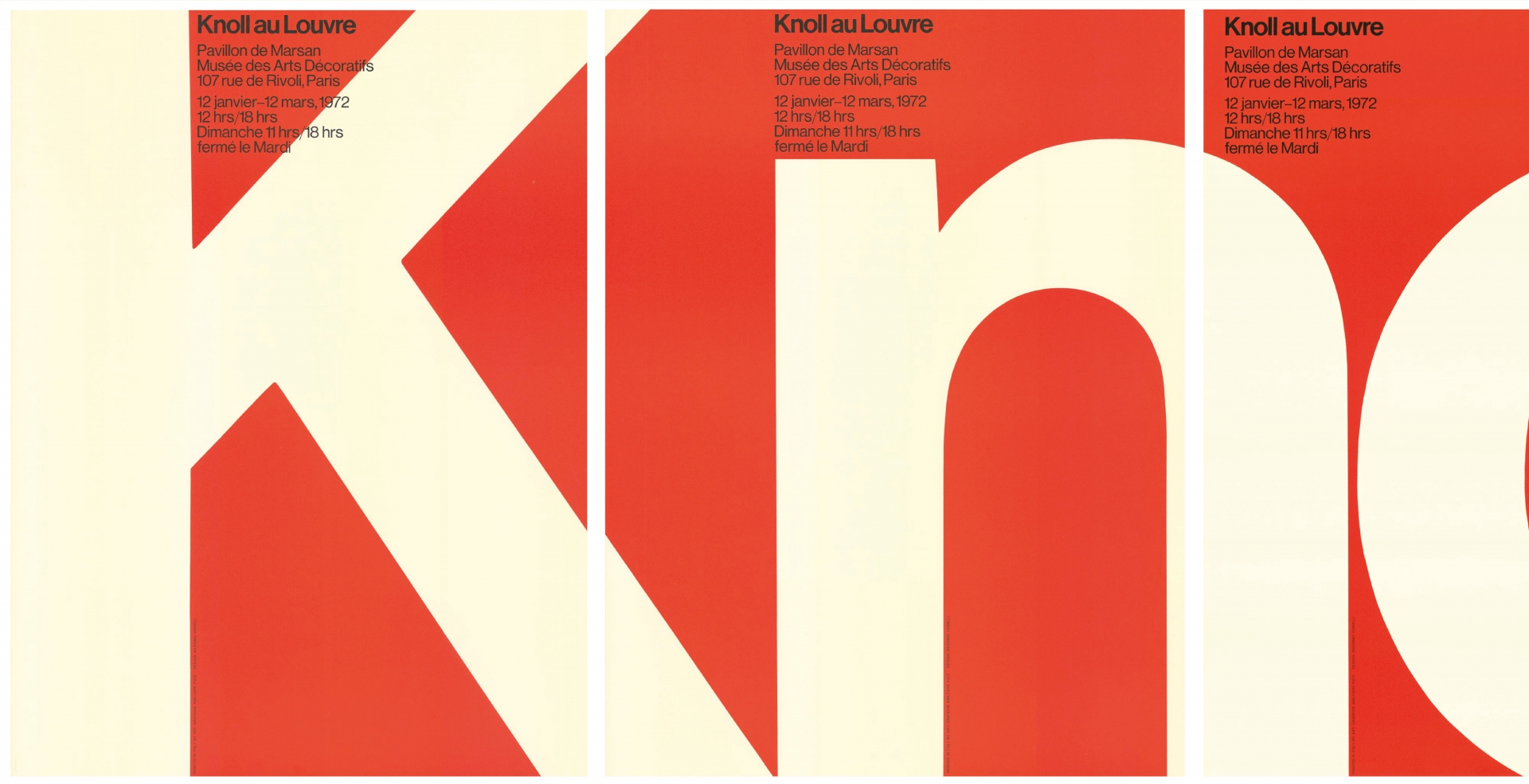
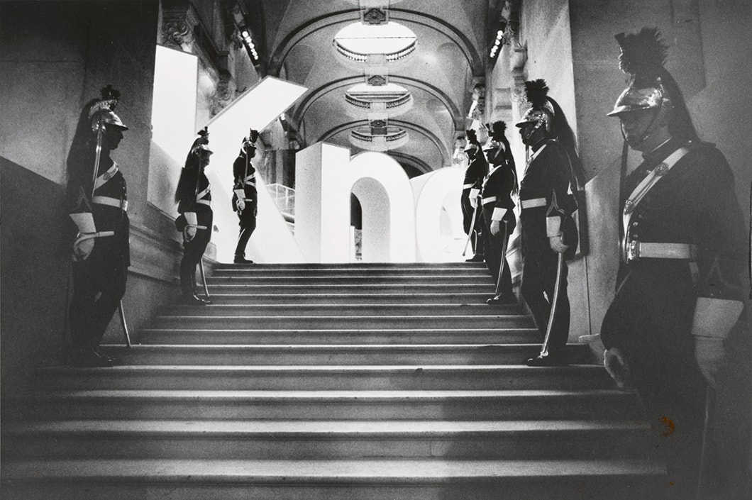
Above: Order Design

Below: Order Design

In a landscape cluttered with designers chasing the "new," Knoll remains relevant because it pursues the correct. It teaches us that when every detail is a part of a harmonious whole, the result is not just a brand, but an environment. And in that environment, there is no room for the accidental. Every line, every color, and every space is an act of intent.

Read Next

The Best Part of Our Home Might Be Us

Archive

In

Sub

TT

Sp

FFT

Privacy Policy

© 2026 FFT. All rights reserved.

Q2

Food For Tought Logo

2026

A: De De Ce

L: Order Design

R: Order Design

Knoll: Total Architecture

Nolan Davis Kiely

Since the inception of the brand in 1938, Knoll has never been in the business of merely making furniture. To the disciplined eye, Knoll is an ongoing experiment in Total Architecture, the belief that a chair, a wall, and a letterform are all governed by the same structural laws. It is a unified expression of space where the object is inseparable from the environment it inhabits.

When we look at the evolution of this identity, we are looking at a history of deep, objective sorting. It is a study of how decades of innovation and the rigorous ghosts of the Bauhaus and the poetic precision of Cranbrook were distilled into a visual language. In the early days, figures like Herbert Matter and Florence Knoll understood that design was a matter of syntax. They didn't just place objects; they engineered a perspective.

The transition of the identity through the years is a masterclass in the preservation of authority. We see this most clearly in the recent work by Order. Order didn't look for something new; they looked for something true. By leaning back into the iconic "Circle K" and the aggressive, clarity of Knoll Red, they reaffirmed that some truths do not require updating.

The choice of typography (moving into Neue Haas Grotesk) is a logical step. It is a digitized revival of the Helvetica forms that defined the Vignelli era, optimized for a world that requires clarity in many different mediums. To use such a typeface is to acknowledge that the grid is a tool. It allows the brand to scale from the micro-detail of a price list to the macro-presence of a showroom without losing its intellectual center.

This is the emotional core of the Knoll evolution: the understanding that design is never finished. It is a continuous effort to ensure that the brand, the product, and the space work together with a seamless, almost invisible friction. We are reminded that a logo is not a badge of identity, but a component of a larger machine.

In a landscape cluttered with designers chasing the "new," Knoll remains relevant because it pursues the correct. It teaches us that when every detail is a part of a harmonious whole, the result is not just a brand, but an environment. And in that environment, there is no room for the accidental. Every line, every color, and every space is an act of intent.

A: Order Design

B: De De Ce

Read Next

The Best Part of Our Home Might Be Us

Archive

Instagram

Substack

TikTok

Spotify

Privacy Policy

© 2026 Food For Thought. All rights reserved.

Q2

Food For Tought Logo

2026

Nolan Davis Kiely

Knoll: Total Architecture

Since the inception of the brand in 1938, Knoll has never been in the business of merely making furniture. To the disciplined eye, Knoll is an ongoing experiment in Total Architecture, the belief that a chair, a wall, and a letterform are all governed by the same structural laws. It is a unified expression of space where the object is inseparable from the environment it inhabits.

When we look at the evolution of this identity, we are looking at a history of deep, objective sorting. It is a study of how decades of innovation and the rigorous ghosts of the Bauhaus and the poetic precision of Cranbrook were distilled into a visual language. In the early days, figures like Herbert Matter and Florence Knoll understood that design was a matter of syntax. They didn't just place objects; they engineered a perspective.

The transition of the identity through the years is a masterclass in the preservation of authority. We see this most clearly in the recent work by Order. Order didn't look for something new; they looked for something true. By leaning back into the iconic "Circle K" and the aggressive, clarity of Knoll Red, they reaffirmed that some truths do not require updating.

The choice of typography (moving into Neue Haas Grotesk) is a logical step. It is a digitized revival of the Helvetica forms that defined the Vignelli era, optimized for a world that requires clarity in many different mediums. To use such a typeface is to acknowledge that the grid is a tool. It allows the brand to scale from the micro-detail of a price list to the macro-presence of a showroom without losing its intellectual center.

In a landscape cluttered with designers chasing the "new," Knoll remains relevant because it pursues the correct. It teaches us that when every detail is a part of a harmonious whole, the result is not just a brand, but an environment. And in that environment, there is no room for the accidental. Every line, every color, and every space is an act of intent.

Suzuki exhibition set up using USM cabinets

This is the emotional core of the Knoll evolution: the understanding that design is never finished. It is a continuous effort to ensure that the brand, the product, and the space work together with a seamless, almost invisible friction. We are reminded that a logo is not a badge of identity, but a component of a larger machine.

Above: De De Ce

Above: De De Ce

Order Design

Order Design

Order Design

Read Next

The Best Part of Our Home Might Be Us

Archive

Instagram

Substack

TikTok

Spotify

Privacy Policy

© 2026 Food For Thought. All rights reserved.