
Mid Century
Inspiration
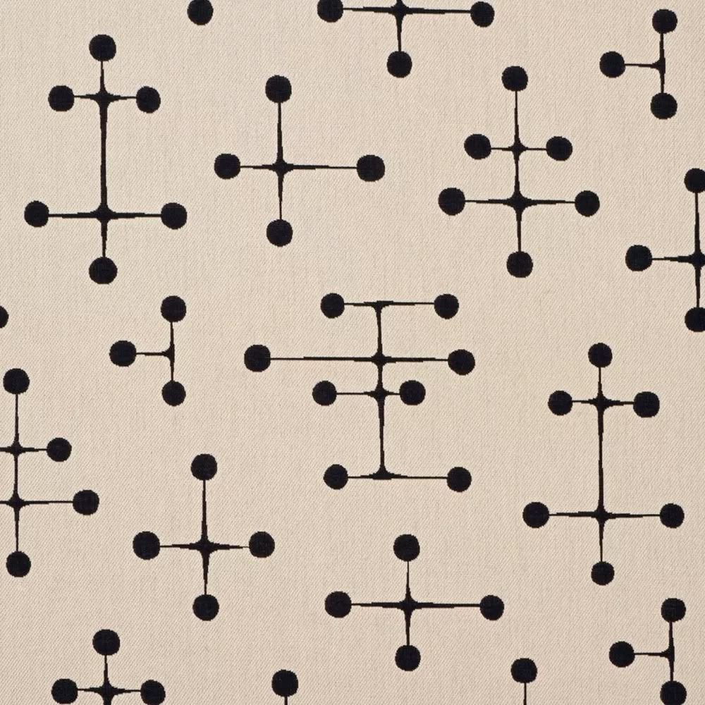
Mid-Century Modern as a whole is so appealing to me. Architecture, interior design, graphic design, I love drawing inspiration from this era and style and attempting to incorporate some of the emotion it provokes in my personal design. This lack of emotion is, in my opinion, the biggest loss of our current design landscape. That said, taking too much from these designs is not innovative. It is a fine line to remain pushing the conversation forward while borrowing elements from the past.
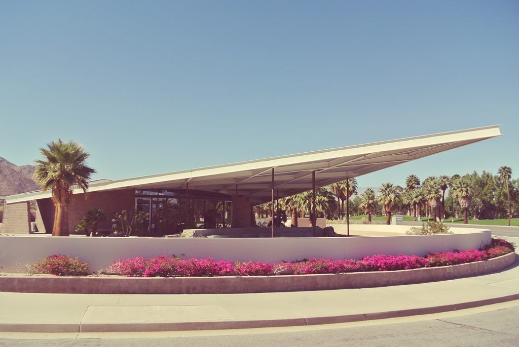
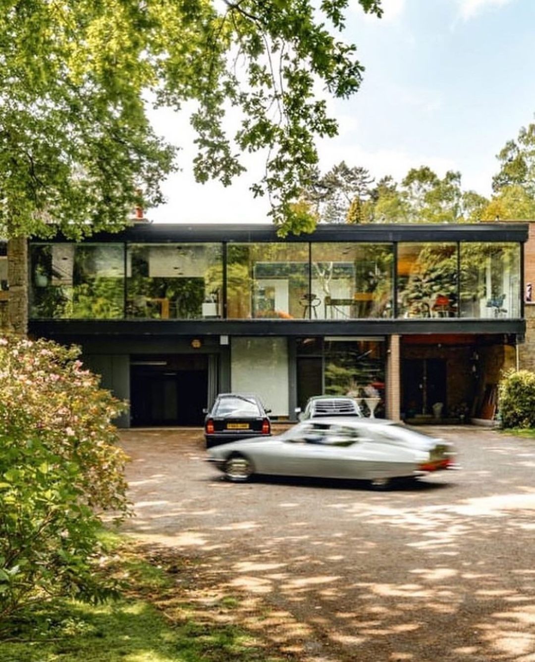
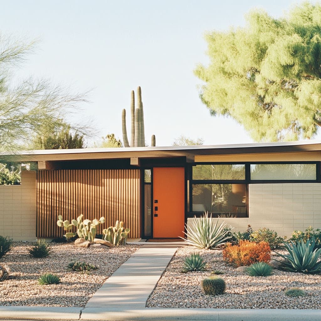
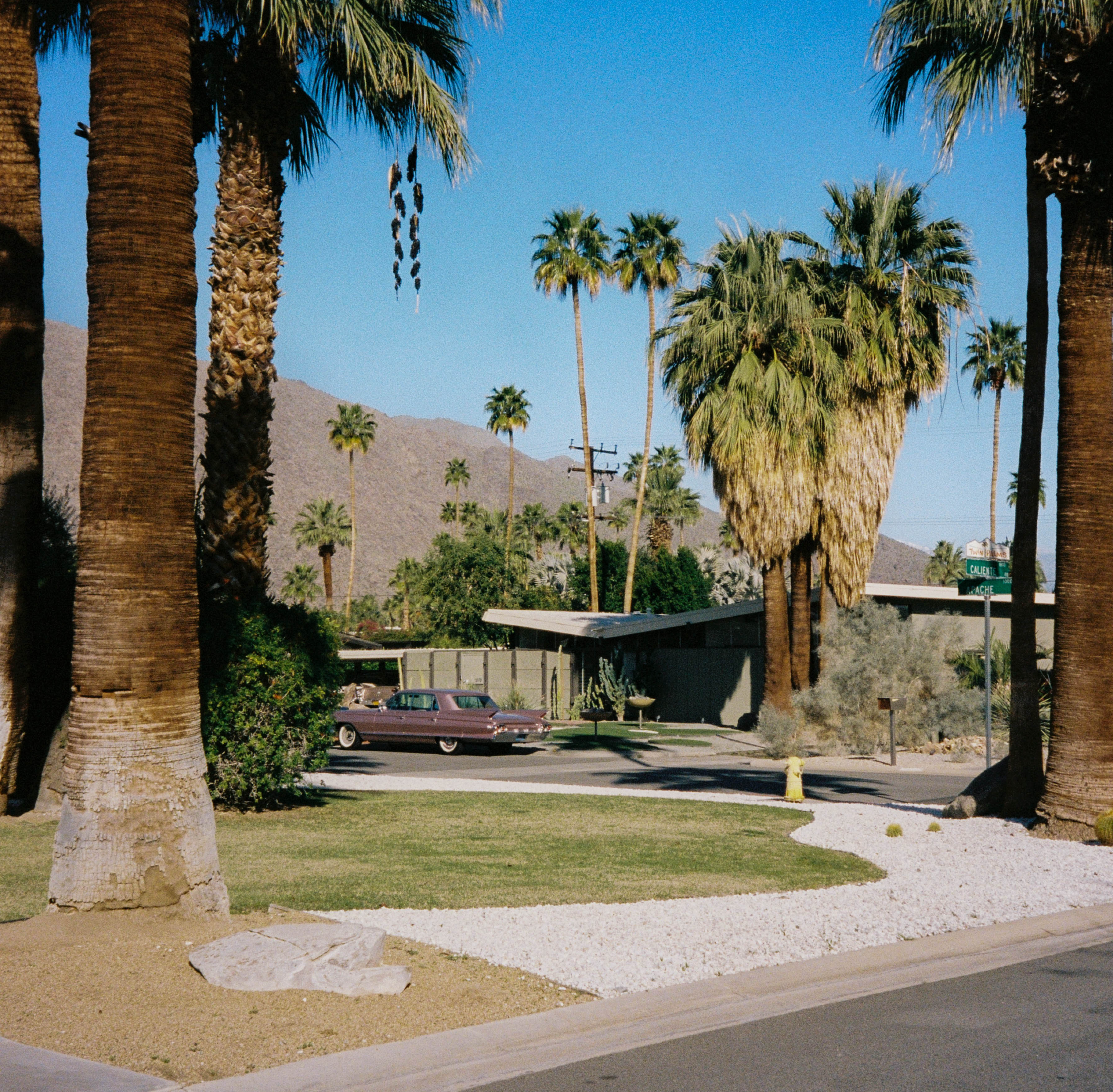
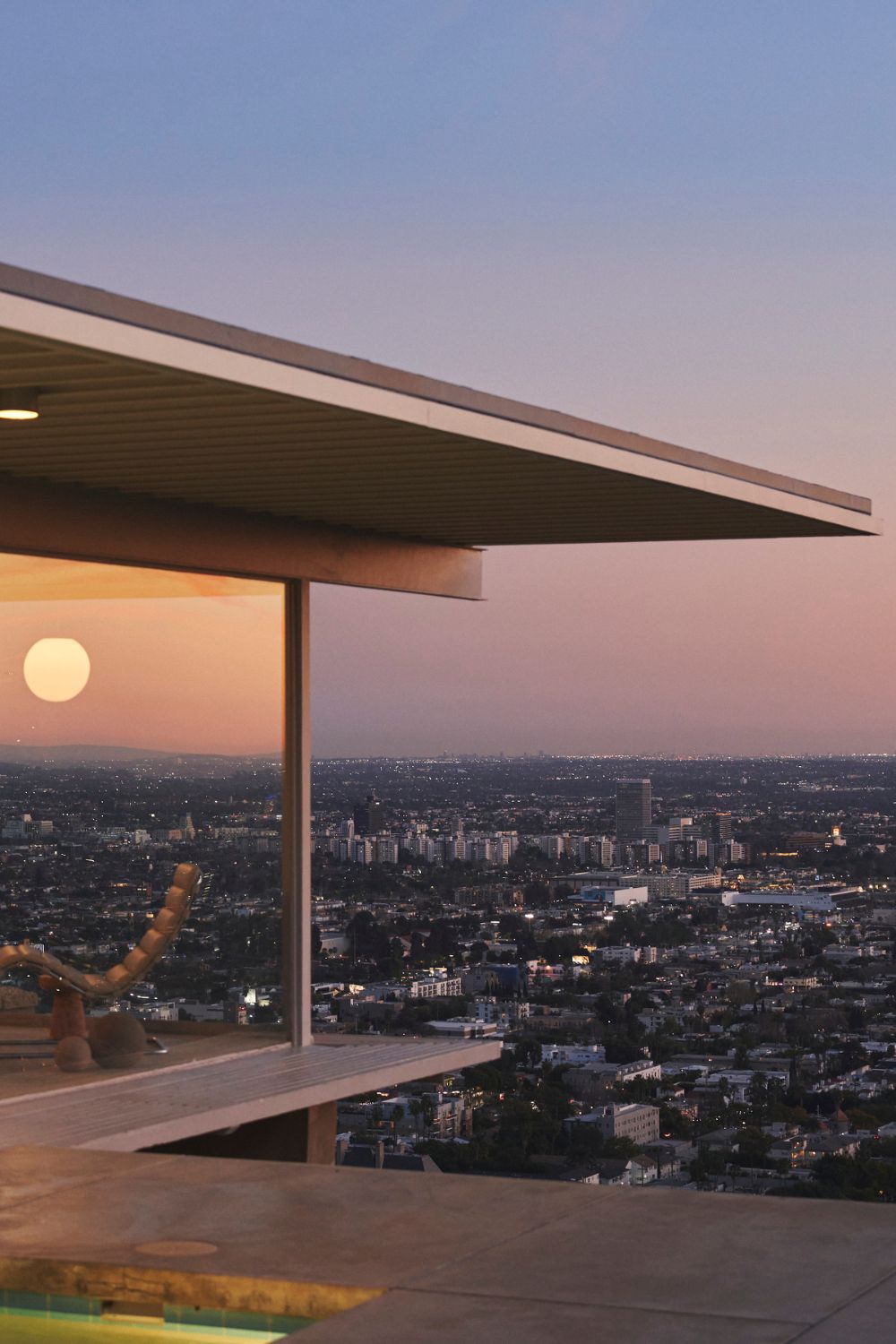
Today, I wanted to share some of my favorite examples from my personal mood boards. I consult these when I am in need of a spark, idea or direction with something. I believe these examples are the well thought out answers to a design question. Most of the architecture from this era was designed to be an ideal living space for a single family, with the briefs asking for a low maintenance construction and surroundings using solid building materials like concrete and wood.
Nolan Davis Kiely
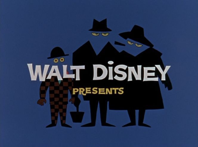
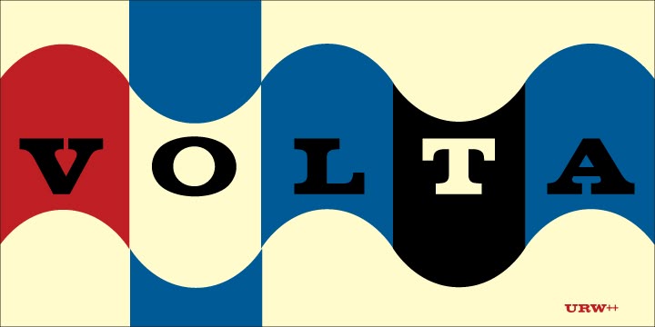
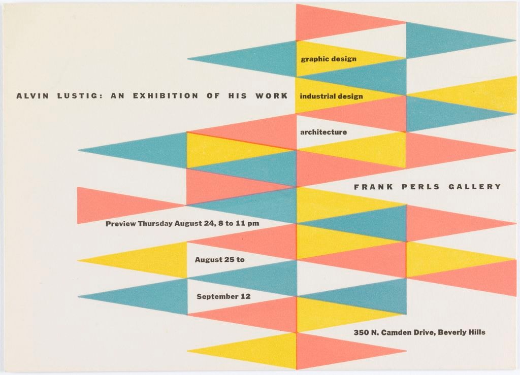
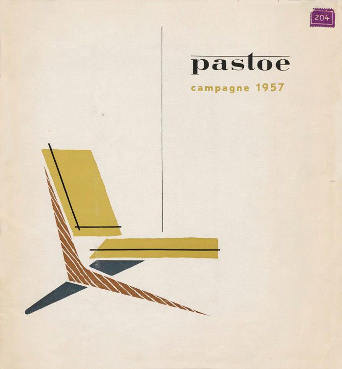
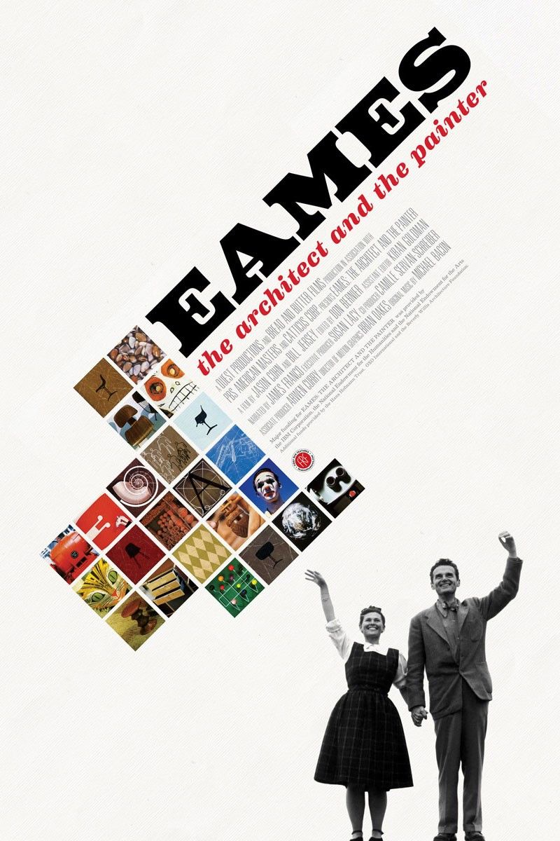
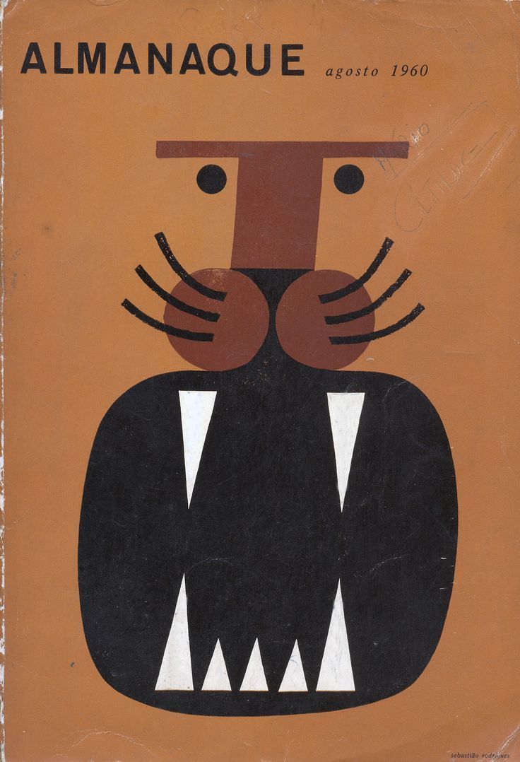
The graphic design is from an era when designers were not afraid to use white space in their layouts. This is something that a lot of designers and agencies are scared to do today, resulting in overcrowding of posters, advertisements and layouts all while not improving clarity enough to justify the traffic in my opinion.
If there is anything that looking at these boards reminds me of it is to keep it simple, it’s not that complicated.
Privacy Policy
© 2026 FFT. All rights reserved.
If there is anything that looking at these boards reminds me of it is to keep it simple, it’s not that complicated.

Mid Century
Inspiration
Nolan Davis Kiely
The graphic design is from an era when designers were not afraid to use white space in their layouts. This is something that a lot of designers and agencies are scared to do today, resulting in overcrowding of posters, advertisements and layouts all while not improving clarity enough to justify the traffic in my opinion.
Mid-Century Modern as a whole is so appealing to me. Architecture, interior design, graphic design, I love drawing inspiration from this era and style and attempting to incorporate some of the emotion it provokes in my personal design. This lack of emotion is, in my opinion, the biggest loss of our current design landscape. That said, taking too much from these designs is not innovative. It is a fine line to remain pushing the conversation forward while borrowing elements from the past.
Today, I wanted to share some of my favorite examples from my personal mood boards. I consult these when I am in need of a spark, idea or direction with something. I believe these examples are the well thought out answers to a design question. Most of the architecture from this era was designed to be an ideal living space for a single family, with the briefs asking for a low maintenance construction and surroundings using solid building materials like concrete and wood.
Privacy Policy
© 2026 Food For Thought. All rights reserved.
Today, I wanted to share some of my favorite examples from my personal mood boards. I consult these when I am in need of a spark, idea or direction with something. I believe these examples are the well thought out answers to a design question. Most of the architecture from this era was designed to be an ideal living space for a single family, with the briefs asking for a low maintenance construction and surroundings using solid building materials like concrete and wood.
If there is anything that looking at these boards reminds me of it is to keep it simple, it’s not that complicated.
Nolan Davis Kiely
Mid Century
Inspiration
Mid-Century Modern as a whole is so appealing to me. Architecture, interior design, graphic design, I love drawing inspiration from this era and style and attempting to incorporate some of the emotion it provokes in my personal design. This lack of emotion is, in my opinion, the biggest loss of our current design landscape. That said, taking too much from these designs is not innovative. It is a fine line to remain pushing the conversation forward while borrowing elements from the past.
The graphic design is from an era when designers were not afraid to use white space in their layouts. This is something that a lot of designers and agencies are scared to do today, resulting in overcrowding of posters, advertisements and layouts all while not improving clarity enough to justify the traffic in my opinion.
Privacy Policy
© 2026 Food For Thought. All rights reserved.